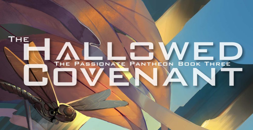
When we started producing The Brazen Altar, the first of our series of weird far-future post-scarcity scifi porn novels, we wanted a book that was lush and beautiful. The world of the Passionate Pantheon is lush and beautiful; the design of the book should be the same.
In the world we’ve created, beauty is a core value, and everything—even things that are intended to be used only once—is aesthetically designed. In a post-scarcity society, nothing is mass-produced. Everything is unique and designed, not for profitability or ease of manufacture, but for aesthetic perfection.
Form and function. For us, they were inseparable.
The covers, we think, are some of the prettiest porn covers you’ll ever see, so we wanted typography that reflected that glorious beauty, more akin to the radiant covers of classic scifi than the dark edginess of modern erotica.
The typography of the Passionate Pantheon novels is also carefully designed to reflect the themes of the stories we tell. We started, of course, with The Brazen Altar, the first book. Over a period of several weeks and many iterations, the cover type gradually evolved and emerged.
We wanted a sans-serif typeface that suggested science fiction without being too Star Trek, and departed from the swoops and curls you’ll often find on erotica. Sleek, not overly fussy, slightly reminiscent of the Golden Age of Science Fiction. Not a simple task. After a lot of thought and searching and exploration, we found it.
The first cover concept used a typeface called Bank Gothic, a Bauhaus-inspired face whose simple geometric designs suggest a 1930s sort of retrofuturism.
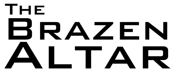
The concept for the book came from a single striking image: a woman bound to an altar atop a great ziggurat on the summer solstice, forced to endure a continuous string of orgasms all day long, from sunup to sundown. The “why” behind this scene became the story of Kheema, and her eighteen-month-long study, meditation, and competition to become that woman.
So we modified the “A” in the word “Altar” to suggest a literal ziggurat:
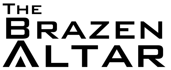
That instantly made it more distinctive in one swoop.
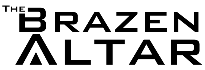
The next problem became the word “The.” A lot of book titles start with the word “The” (The Girl with the Dragon Tattoo, The Hitchhiker’s Guide to the Galaxy, The Ocean at the End of the Lane, The Player of Games), and what to do with the word “The” is always a challenge.
We didn’t want to just stick it on the title like a lumpy outcrop; we wanted it to be integrated without being too overpowering. And so, the first book’s typography was born (and it was a tedious labour indeed – that placement is far more delicately balanced than you might believe).
The second book in the series, Divine Burdens, keeps this same stylistic language.

Again, we wanted a title that suggested the theme of the book, so we reworked the V in “Divine” mirroring the way we’d done the A in “Altar,” to suggest a physical vessel, carrying its burden.
The third book, The Hallowed Covenant, was even more challenging.

This is the final design we ended up with, after a great deal of tweaking and adjusting.
We used the same treatment for the A and the V in “Hallowed” and “Covenant” as we did in The Brazen Altar and Divine Burdens, but we also spent a lot of time and effort carefully tweaking the letterspace and line space to integrate the two letters into one seamless line. .
We made sure that the right-hand leg in the A precisely continued into the left-hand leg in the V. If you mentally extend the letters, they meet exactly.
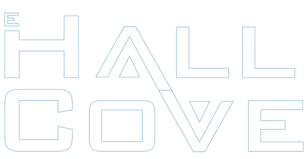

The Passionate Pantheon series is written so that odd-numbered books are upbeat and Utopian, while even-numbered books are dark erotic horror. We were delighted that the title of the third book offered this very subtle opportunity to unify the first two books in its design language.
We also modified the first O to suggest a container with a lid, as the image most people (in the West) first think of when they hear the word “covenant” is, of course, the Ark of the Covenant.
And yes, all of that was exactly as fiddly as you would think. And no, we did not expect that most people would notice it.
That’s not why we did it.
But if you happened to notice, and that made you pause for even a moment in admiration…well, all we can say is: yeah, us too. Us too.
